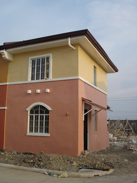
Before any updates, let me share you the old photos of the finished product before it was turned over to us. Tadaaa! all yellow and orange. Yes, I was fully aware of how it would look like. The construction was done in 2006, just after a year I signed the purchase. Well, this 9 year old baby will soon become a beauty.
 |
Fresh looking without any cracks or signs of wear.
|
 |
The left side of the house.
Design as a whole looks outdated and blah for a house in 2006. Jalousie slats are a little bit of 80s. So when it was first renovated a few years ago, the windows were replaced with french windows, making it all same.
But with this current renovation, I made sure that all windows are made of plain tinted glass to allow natural light and air in.
|
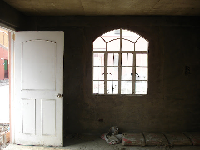 |
The living room. The white door was not bad-looking at all but I don't think it has survived because I haven't seen it on my last visit.
|
 |
From the moment I saw the stairs, I made a mental note that it was meant to be revised considering safety and beauty.
|
 |
The sub-par looking ceiling. I know not a very nice looking house but owning a property with your name on it, a house and lot for that matter regardless of its size, is something worthy. Even if at the time my intention was not purely for it to become my abode but to have it rented, I am glad I did not sell it because at some point long ago, I was planning of doing so. Good that I was too busy with many things that I apparently forgot such plan.
|
The current progress as of this writing.
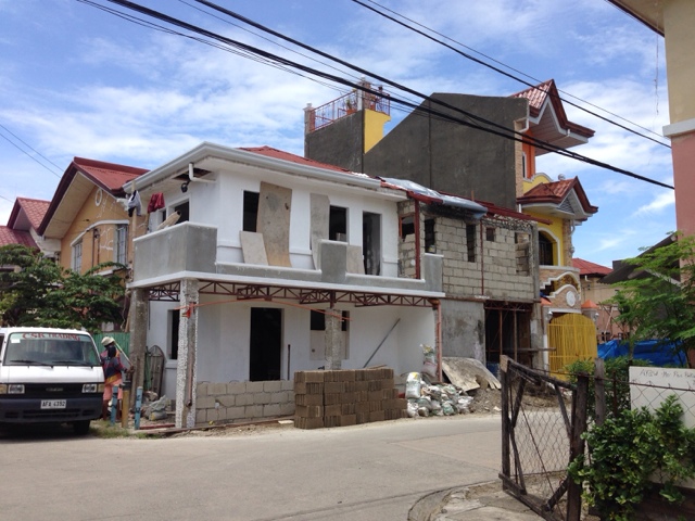 |
Isn't she getting prettier everyday?? From afar it looks like a clinic and it will continue to look like one because I am having it painted with white (I don't have the exact shade). Brick accents will fill the terrace.
|
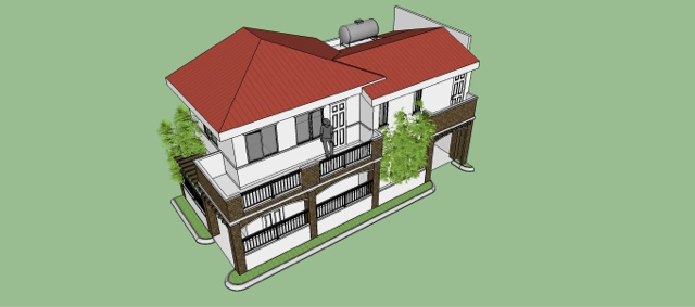 |
And this is the design. I did not have any input in terms of the basic design. We let our contractor take liberty with it and he in turn allowed us to comment for any revisions on the details we have in mind.
|
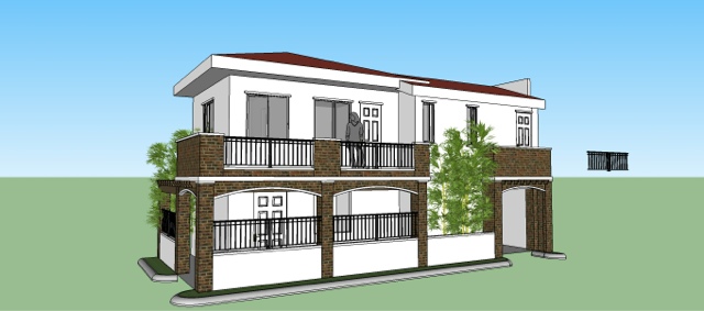 |
The room above the garage will be the master's bedroom, while those tiny narrow windows just above the bamboo trees (i assume) is Amber's room. However, this will be revised because the master's bedroom appear (in fact) without a window from this side. So the door will be scrapped out from the design and in its place will be sliding glass doors allowing the master to see the outside world =P.
To describe this design, it looks simply modern and the presence of terraces in brick accents looks Western. The size is Asian which fits within my budget. I was inspired by homes in Japan - compact, plain and free of unnecessary ornaments.
|


No comments:
Post a Comment